I’ve become a fan of a bookmarklet tool called Readability.
What it does is remove the clutter from a content-rich webpage and optimise it for ‘readability’ (which of course, itself can be customised). Now museums tend to be serial offenders on text-heaviness – we love long text and I’m not one to argue that we should shorten it.
So whilst everyone emulates the ‘Print Version’ stylesheets that newspaper websites have these rarely make content more readable on-screen – that’s not their point. What Readability does is leaves the ‘Print Version’ to the end-user’s discretion and re-renders the content in a form that is immediately more readable on-screen.
To check it out install the bookmarklet in your browser bar then visit a content rich page, click the bookmarklet and voila, a more readable version!
It works on most browsers and seems to do a good job on most websites.
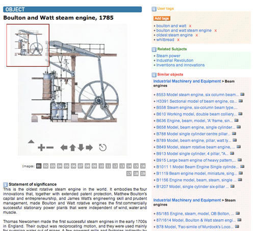
Here’s what happens to our very own collection records.
Before

After
