Categories
Developer tools Web metrics

Fixing document download and link tracking with the Google Analytics asynchronous tracking code

If you’ve been using the gatag.js from Good Web Practices in conjunction with your Google Analytics code for the past few years you may have noticed that it stopped working when you updated to the newer, better asynchronous Google Analytics tracking code.

What was nice about the gatag.js code was that it was quick and easy to implement and tracked downloads of PDFs and other file types as well as traffic following any outgoing links. For cultural institutions which are full of such PDFs and external links, tracking these as distinct ‘EVENTS’ in Google Analytics was very useful for understanding user behaviour on your site.

There’s not been a clean and simple fix for this problem and until I saw Stephen Akins’ solution using jQuery I thought we’d have to go back to other methods.

Our developer, Carlos Arroyo, made some minor modifications to Stephen’s code so that the way in which downloads and external links appeared in the reports would stay the same as those used by gatag.js allowing for historical comparisons.

First remove your references to gatag.js then place this after your Google Analytics asynchronous tracking code. (If you already load jQuery on your site then you probably want to check the version and you can omit the first section.)

(And of course you use this at your own risk!)

<script type="text/javascript">
		if(typeof jQuery != 'function'){
		var script = '<script type="text/javascript" src="http://ajax.googleapis.com/ajax/libs/jquery/1.6.2/jquery.min.js"></script>';
		document.write(script);	
	}

</script>


<script type="text/javascript">

	$(document).ready(function(){
		
		$('a').mouseup(function(){
  			href = $(this).attr('href');
  			href_lower = href.toLowerCase(); 
  			if(href_lower.substr(-3) == "pdf" || href_lower.substr(-3) == "xls" || href_lower.substr(-3) == "doc" ||
  			   href_lower.substr(-3) == "mp3" || href_lower.substr(-3) == "mp4" || href_lower.substr(-3) == "flv" ||
  			   href_lower.substr(-3) == "txt" || href_lower.substr(-3) == "csv" || href_lower.substr(-3) == "zip") {
   				_gaq.push(['_trackEvent', 'Downloads', href_lower.substr(-3), href]);
  			} 
  			if(href_lower.substr(0, 4) == "http") {
   				var domain = document.domain.replace("www.",'');
  				if(href_lower.indexOf(domain) == -1){
				href = href.replace("http://",'');
				href = href.replace("https://",'');
 					_gaq.push(['_trackEvent', 'Outbound Traffic', href]);
   				}
  			}
 		});
	});
</script>
Categories
Collection databases Mobile QR codes User experience

Making Love Lace – a cross device exhibition catalogue & the return of the QR

Estee Wah has been busy bringing Love Lace, our upcoming contemporary art exhibition, online. She’s been wrangling content and ensuring that the website is able to act as a fully fledged (and expanding) catalogue for the show as well as revealing much of the individual artists’ processes in a behind the scenes section.

This exhibition sees the return of QR codes to the Museum (as well as, later, the trial of the tracking pilot).

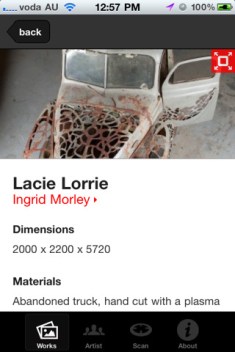
To solve one of the big problems with QR codes – that people just can’t be bothered downloading a QR code reading application (or firing it up if they do have one), our internal developer Carlos Arroyo has built the exhibition iPhone and Android App with the QR code scanner built in! This means anyone who downloads the exhibition App – itself a full catalogue of the exhibition designed for in-gallery supplementary browsing now also has their QR scanner at their finger tips.

As the QRs are scanned – from within the App – the relevant exhibition object immediately launches in the App. Carlos has also managed to nail down error correction and the scanning is now really good even in low light and on low resolution cameras.

Like for Sydney Design and the Go Play Apps we’re using Flurry to track in-App actions so we can see which objects get scanned and viewed.

(There’s even a mobile website that mimics the App – without the scanner – if you don’t choose to install the App!).

We’ll keep you updated on how it goes and when the automated tracking goes live. Carlos is already working on a v1.1 version of the App to roll out shortly with some new interaction options.

Try out the iOS App in the AppStore. And the Android version of the App is on the Android market also.

Categories
Mobile Powerhouse Museum websites Young people & museums

Updating Go Play – the cross-agency school holiday calendar

Last September we quietly launched the alpha version of Go Play, a site that Powerhouse was commissioned to produce for the then Communities NSW (now Office of Communities). Go Play was built to address the problem of the general invisibility of the wealth of great school holiday events, often free or low cost, put on by government organisations. On commercially operated parental events calendars these cultural events are buried amongst the latest family movies, and on individual government agency websites there is no suggestion that there might be other relevant activities nearby. Beginning with the cultural institutions and sport and recreation facilities, the site was also built to ensure that event metadata was enhanced with standardised parent-focussed information like age suitability and whether or not the venues have baby change facilities etc.

Initially managed by Renae Mason at the Powerhouse and programmed by the IXC, the Go Play went live as a public alpha with school holiday activities collated from five NSW government agencies to test the database structure and robustness. In December the site, complete with a stack of bugfixes, went into beta with more agencies involved.

Under the purview of a new producer at Powerhouse, Estee Wah, the April holidays came around and the site continued to grow with more and more contributors and general operations for the site began shifting over to staff fat Office of Communities. At the same time for April, we launched a mobile App version of Go Play funded through Apps4NSW and was developed by The Nest.

Now we’re in the winter school holidays and the site has just added even more partner organisations and the App has also received its first major update.

Not only that, the enhanced event copy is now licences under CC-BY-NC for re-use by others (excepting, of course, the images). The event data and venues can be obtained as XML from the Data Output section. (Alternative licensing of the data can no doubt, be negotiated).

So how has it gone?

Go Play, to date, has shown that with a mix of great SEO and search marketing coupled with a relatively simple UI there is a good audience for tightly focussed cross-agency event calendars. Traffic has been strong with each holiday period delivering more and more visitors to the site – now nearly 60K – and consolidating repeat visitors. The iOS App has had nearly 1100 downloads since launch, and the update has been applied 234 times in the last few days since release showing ongoing usage by those who downloaded the first version.

Not surprisingly, those institutions who chose to add the Go Play banners to their own sites ended up sending a good deal of traffic to the site – showing that, unsurprisingly, parents who visit, say the Powerhouse Museum website looking for holiday activities are interested in seeing what else in on too. It would seem, too, that those who sent traffic also had their own events viewed the most in Go Play creating a net gain in traffic and awareness, instead of a net loss.

The initial ideas that such a site might be able to run automagically, harvesting new content from participating institutions, have unsurprisingly been optimistic. In fact these were scoped out after the initial alpha release and the focus on having a human editor who ensures that events have full enhanced metadata not only makes the site a lot more valuable to parents but also realistically deals with resource levels at contributing agencies.

Next school holidays the site will be completely under the operation of Office of Communities and will hopefully grow to take on many more content partners (local government is an obvious option), and maybe down the track be able to operate all year round.

Check out the Go Play site and the free iOS App!

Categories
Mobile Powerhouse Museum websites User experience

Building Sydney Design 2011 as a cross-platform site

It has been over a month since my last post here and everyone has been flat out working on a slew of projects, most of which have just gone public. The lead up to August is always one of the busiest times of the year at the Powerhouse with both Sydney Design and Ultimo Science Festival taking place each August, and this year these have been joined by a major contemporary art exhibition launch and the Powerhouse’s revitalisation works.

The next couple of posts will look at some of the new things that have gone live.

Nick Earnshaw in the Web Unit has been handling Sydney Design and Revitalisation and both of those sites, running on WordPress, are now live.

Sydney Design was built by Mob Labs using a concept and design by Toko. Mob Labs have built both a web and mobile web version of the Sydney Design site and the iPhone App version is due to go to the AppStore any moment now.

We’re excited about this year’s Sydney Design site because it has been built to be even more decentralised than previous years. The Powerhouse IT team reconfigured an install of our helpdesk/job-tracking system, JIRA, to allow external Sydney Design partners to enter their events remotely and the Powerhouse Contemporary team, who organise Sydney Design, to assess them. Chris Bell in the IT team then exported these into a custom WordPress install where the final event editing took place whilst Mob Labs configured custom themes for the site itself. We’re also indebted to MOMA’s work in creating a very useful JSON API plugin for WordPress which made the resulting site build by Mob Labs considerably easier.

You’ll also notice that the site integrates Facebook using a subset of the Opengraph features to make it clear which parts of Sydney Design your friends like and making rough recommendations. We were inspired by the Sydney Festival site to do this and we’ll be keeping an eye on it to see how effective it is for the more niche audiences of Sydney Design.

The Contemporary team at the Museum have also been busy making sure there’s vox pops and other content going out on Facebook and Twitter as well as embedding them into the relevant events (eg. 1 | 2) on the site itself.

Mob Labs did a great job on the mobile site which has some nifty swipe interface action and geo-location in mobile browsers – give it a go on an iPhone, Android or Blackberry and see. And once the native App goes live we’ll be able to see how many iOS users choose the App over the Mobile Web version of the site.

Maybe this year will be the last time we feel we need both a mobile website and an App.

Categories
User behaviour User experience

Prototyping moveME – a location-aware indoor mobile App with tracking

Last week at CeBIT the announcement came through that a project that has been under wraps for a little while now received NSW Government funding to move ahead. It is a collaborative project bringing together commercial partners with the Museum being used, as our Director puts it in the media release, “to directly support the NSW technology industry by being a ‘living laboratory’ for the development of this product”.

A consortium formed by Smarttrack RFID, RAMP RFID, MOB and the Powerhouse Museum is delighted to be selected as one of the first recipients of funding from the NSW Government under the Collaborative Solutions program. Announced on Tuesday 31 May, the NSW Government’s Collaborative Solutions programme aims to help build the digital economy in NSW.

And although there’s two companies involved with RFID in their names, this project is not about RFID at all – but instead is developing and trialling a mobile platform which, combined with indoor location awareness, is able to deliver customised content to visitors and also deliver valuable spatial analytics data back to the museum to assist with future exhibition design and spatial configuration.

Julian Bickersteth and Christopher Ainsley delivered a paper, Mobile Phones & Visitor Tracking, at Museums and the Web 2011 that outlined the broad premise of the project in April.

Discussing the use of tracking applications in the retail sector they wrote,

The museum sector is small and consequently does not have the resources to make use of this opportunity. However, significant components of museum operations have synergies with the retail sector, a part of the economy with deeper pockets for exploring new technologies. The museum sector has a history of piggy backing on the technological developments of its retail cousins, whether in the overt area of streamlining their own retail operations (both in the museum shop and on-line) or more subtly in using retail counting systems to accurately count museum visitors.

Shopping malls in particular share many physical characteristics with museums. They are both likely to be large masonry structures with a limited number of entrances, to contain a series of retail or exhibition spaces along with catering areas, joined by large open spaces. Both shopping mall and museum operators want to know where the more and less popular areas are located, what the dominant paths followed by visitors are, how long they spend in catering outlets and retail stores, and how long they spend in the mall/museum as a whole.

For the retail mall operators (known in the business as RAMs or Retail Asset Managers), critical to their thinking is adjacencies and synergies of the retail and catering mix so as to maximise rental income through more intelligent leasing. This in turn allows them to charge top dollar for shops in prime positions, and also control who gets a lease in the first place.

I sent Julian a number of questions about the project to expand on.

F&N – How did moveMe come about?

MoveMe started as visitor counting project which then expanded into visitor tracking. Visitor tracking works best if the visitors are using an App (giving them a reason to turn their devices on etc), hence the addition of the App. But then the packaging of this offering to include location specific content delivery and way finding clearly became a much more interesting space to be in, hence the evolution into moveMe.

F&N – How effective has this technology been in the shopping mall environment? What sorts of business decision making has this enable or improved?

This is still being trialled, but where it has in US department stores and super-hardware stores, it clearly has the ability to help staffing and also response to promotions. Since both these areas are high cost items, it is data they are very keen to get their hands on. [There’s some expansion on this in the MW paper]

F&N – You’ve seen a lot of mobile projects around the world. How does this differ in potential from what you’ve seen at AMNH and, locally, MONA?

Both AMNH and MONA cost absolutely heaps to design and install. Our solution is going to be much cheaper to deliver because it uses a different technology for tracking. Also it will be designed as a generic rather than a bespoke solution, so can be provided over the Internet for museums to locally self install and use.

F&N – What do you hope will be the key benefits of this system that is being prototyped?

For the visitor, focused delivery of far wider information than they could ever get from a label, plus the removal of having to squint at and possibly queue to see a label before they know what you are looking at. Also way finding. This is a critical issue in any big museum, which actually puts people off exploring as they might get lost. For the museum the ability to provide access to much more information plus also understand visitor patterns and behaviour in a way which up to now has just not been possible in a systematic and regular way

The prototype will be bundled into a cross-platform exhibition App that we are building in-house for the upcoming Love Lace – Powerhouse International Lace Award exhibition that launches with Sydney Design 2011. This will provide the first access to the technologies involved and also demonstrate how it can be potentially plugged into existing mobile tour platforms if required (as well as provide a full service for those without an existing App).

We will keep you posted on the project as it develops.

Categories
API Collection databases

Powerhouse Object Name Thesaurus now available via our API!

Luke Dearnley is at LOD-LAM this week and he and Carlos Arroyo are pleased to publicly announce that the Powerhouse Object Name Thesaurus is now available through our API.

The Object Name Thesaurus was developed by the Powerhouse Museum to standardise the terms used to describe its own collection. It was first published in 1995 as the Powerhouse Museum Collection Thesaurus. Since then, many new terms have been added to the thesaurus within the Powerhouse’s collection information and management system. The print version has long been popular with collecting institutions to assist in the documentation of their own collections.

Whilst you have been able to download the thesaurus as a PDF for a fair while, the API now makes it possible to build applications on top of the thesaurus to do things like explain terms or even expand the search on your own website to show results from ‘related or child terms’. And of course, if you’ve built applications using the Powerhouse Collection you can now show related parent and child objects. The thesaurus, like the rest of the API defaults to a CC-BY-NC license although you can approach the Museum for a variation on request.

The hierarchical structure of the thesaurus assists in searching. By organising object names, the relationships between objects can be made explicit. Object names are organised according to their hierarchical, associative or equivalence relationships. The object name thesaurus allows for more than one broader term for each object name. Any term is permitted to have multiple broader terms, for example ‘Bubble pipes’ has the broader terms of ‘Pipes’ and ‘Toys’. There is no single hierarchy in which an object name is located, enabling it to by found by searchers approaching with different concepts in mind.

Here’s an example of the sort of return you can now get from the API.

{
    "status": 200, 
    "end": 50, 
    "start": 0, 
    "result": 50, 
    "terms": [
        {
            "status": "APPROVED", 
            "scope_notes": "Any of a variety of brushes used to remove dirt and lint from clothing.", 
            "term": "Clothes brushes", 
            "num_items": 4, 
            "num_narrower_items": 0, 
            "relations": {
                "narrower": [
                    {
                        "status": "APPROVED", 
                        "scope_notes": null, 
                        "term": "Hat brushes", 
                        "num_items": 2, 
                        "num_narrower_items": 23, 
                        "id": 5104
                    }
                ], 
                "broader": {
                    "status": "APPROVED", 
                    "scope_notes": null, 
                    "term": "Laundry equipment", 
                    "num_items": 11, 
                    "num_narrower_items": 0, 
                    "id": 1189
                }, 
                "related": {
                    "status": "APPROVED", 
                    "scope_notes": "Used to remove dust and dirt from clothing by beating.", 
                    "term": "Clothes beaters", 
                    "num_items": 0, 
                    "num_narrower_items": 0, 
                    "id": 2802
                }

The code snippet above shows the usage of terms (sometimes a bit like a definition) and the broader/narrower relationships between the terms themselves.

Laundry equipment is a broader term under which Clothes brushes sits. Clothes brushes are used as “Any of a variety of brushes used to remove dirt and lint from clothing.” and they have a single narrower term Hat brushes.

Not only that, but Clothes brushes are related to Clothes beaters which are “Used to remove dust and dirt from clothing by beating”.

If you were, say, running a collection search (or even an ecommerce system) for old washing machines and related equipment your application could use the Thesaurus in the API to make recommendations on your own site using the broader/narrower terms from our system. In that sense a user searching for “hat brushes” on your website could also be expanded to show them results for “clothes brushes” and “clothes beaters”.

And of course, you can also get the Powerhouse objects under each of these categories.

Rough documentation is available (with better documentation coming soon).

We’ll be adding to this over the coming months and we’d love your thoughts on how this might be useful to you in your own applications.

Categories
Mobile

First of our walking tours is in the AppStore

This week the first in a series of walking tour iPhone Apps went live in the AppStore. Here’s the skinny.

This tour has been developed from a printed tour produced by Curator of Astronomy, Dr Nick Lomb, in 2009. It has been expanded to include a tour of the Sydney Observatory precinct, the Observatory, grounds, Signal Station, flagstaff and Fort Phillip. It reveals how central Sydney Observatory was to the development of scientific research in New South Wales. Observatory Hill has been the astronomical hub of Sydney since 1858 when the Observatory commenced operation there, and also played a vital role in the time-keeping, navigational and meteorological life of Sydney. The tour includes not only fascinating historical information but also captivating views of Sydney Harbour from Observatory Hill, Sydney Harbour Bridge and Dawes Point, as well as taking a delightful path through the Rocks.

Online Producer Irma Havlicek started this project by first walking the original printed map tour (PDF). As she walked the tour she found that there was a lot more opportunity to highlight other locations, whilst at the same time removing a few locations that were too far away to comfortably reach in a single walk.

Using the intuitive online tour App maker, MyTours, she pulled together images, dropped pins on the interactive map, wrote a script, and built a demo version. It took several more walks with the demo version on her iPhone to refine the tour to the current version.

After the literal road testing, Irma then recorded the audio track from her script and walked the route again this time with audio in her ears. This continuous in-situ testing was very time consuming but ultimately incredibly worthwhile as we now have a tour that is tightly edited and, depending on the weather, great to walk and enjoy.

When it came to submitting to the AppStore we had a lot of discussions about the pricing. Because the MyTours pricing model charges a monthly fee for free Apps but takes only a cut from charged Apps we were already leaning towards a low-price.

In the end we settled on an initial list price of AU$2.49.

Of this Apple takes its customary 30% and then MyTours 50% of the remainder (35% of the total).

Personally I think this is a very fair price. It is as cheap as can of soft drink and less than a coffee. I hope that the price also indicates that the walking tour has been made with care and we feel is worth at least that much.

We aren’t measuring success by the number of downloads but in the number of completed tours. And I strongly believe that a low price (vs free) will lead to more tour completions relative to total downloads. We will get less ‘speculative downloads’ and more intentional ones – unlike a general informational App that a museum might make, a walking tour App is not something that has a great deal of purpose unless you are intending to walk it. (And we’re keeping the free PDF version available regardless).

We’ve got signage coming at the Observatory so that visitors to the site in the day will be aware of the existence of this ‘visit extension’, and the public wifi at the site will make downloading the App and the tour as painless as we can currently make it.

We are launching a few more walks in the coming weeks with some other models being experimented with – and I’ll keep you posted on how it goes.

Categories
AV Related

AR drone test flights – flying over the collection

If you’ve been following some of us on Twitter you will know that the Digital teams have been experimenting with different kinds of consumer-grade filming technologies to offer new ways of seeing behind the scenes at the Museum.

We’ve had the camera-mounted robot cockroach that scuttles underneath large objects to view the undersides of things, and the iPad/iPhone controlled consumer-grade Parrot AR Drone which flies over and around objects.

Here’s some footage of a few test flights in the Castle Hill storage facility.

As you will see the resolution and framerates are currently too low for this sort of footage to be really useful. However this is early days and we think the idea of flying cameras around and through the collection has a lot of potential.

In fact, beyond the collection potential, our lighting technicians immediately saw the potential of using such drones to check the settings on light fittings usually only accessible with ladders and scaffolding.

Categories
Mobile

Nancy Proctor talk at Powerhouse Museum 19/4/11 on mobile 2.0

Early this week Nancy Proctor, Head of Mobile Strategy at the Smithsonian Institution gave a free talk at the Powerhouse, courtesy of Museum3 and RMIT.

The talk is quite a sobering walk through some of the emerging realities around the cost and rationale for mobile, as well as a discussion around how collectively we might move beyond thinking about mobile as ‘just audio tours 2.0’.

Nancy Proctor, Smithsonian Institution at the Powerhouse Museum 19/4/11 from Powerhouse Museum on Vimeo.

The video starts after the audience has been watching the trailer for Scapes, a very interesting location-based sound art project by Halsey Burgund that combines generative audio with visitor/listener recorded feedback.

Advance apologies for the audio quality.

I’d highly recommend reading this paper – Getting On (not Under) the Mobile 2.0 Bus: Emerging Issues in the Mobile Business Model – from Museums & the Web 2011 on mobile as complimentary material.

UPDATE: Nancy’s slides from the evening are available below.

Categories
Collection databases open content Powerhouse Museum websites

Introducing the alpha of the Museum Metadata Exchange

The Museum Metadata Exchange (MME) is a project that started mid last year (2010) as a collaboration between the Council of Australasian Museum Directors (CAMD) and Museums Australia (MA). Funded by the Australian National Data Services (ANDS), the project is key infrastructure to deliver museum collection-level descriptive (CLD) metadata to the Australian Research Data Commons (ARDC).

That’s acronym city. So here’s the human-readable version.

The MME takes a different approach to collections. Instead of focussing at the object or item level, it moves up a notch to ‘collection level’. This has the benefit of providing an overview, a meaning and a scope that can be hard to ‘see’ at object level – especially if you were, say, looking for which museums had shoes made in the 1950s and worn in Australia. The other benefit of collection level descriptions is that the objects grouped in this way don’t necessarily need to be online or digitised (yet) in order to be discovered.

The project is funded by ANDS in order to ensure that these descriptors of museum collections are added to the Research Data Commons to be used and explored by academic researchers. In many ways this makes a lot of sense – academic researchers are far more likely than general web users to need to come and see the ‘real’ objects and make long term connections with staff at the host museum to conduct their research. And so, by exposing collection level descriptions especially for ‘yet to be digitised’ collections, the project is pulling back the curtain on those hidden gems held by museums across Australia. In fact, several of the staff working goon the project who deal with objects everyday were regularly surprised by what they were finding in other people’s collections – “oh I had no idea that they had some of those too!”.

Collection level descriptions have provenance and descriptive metadata along with semi-structured subject keywords, temporal, spatial and relational metadata. (Here’s a list of 66 Powerhouse collections and a single record on our rather excellent Electronic Music Collection.)

The first public iteration pulls together nearly 700 collections from 16 museums across Australia and future iterations will add more – primarily major regional collections, I would expect.

But . . .

The site itself is really a simple public front-end for a data transformation service. It isn’t supposed to be the primary place for anyone, not even researchers, to search or browse these collection level descriptions. It is a transformation and transport mechanism that acts as broker between the individual museums and the Research Data Commons. To this end anyone can download the XML feed of the collection level data from the site – this is the same data that gets passed on to the Commons.

Of course, we’ve tried to ‘pretty-up’ the rawness of the site a bit. The first iteration has lovely identity work done by emerging Newcastle-based designer Heath Killen. But the search is very rudimentary and there is currently no way to pivot by keywords or do the temporal or spatial searching – this sort of functionality is supposed to be handled by the various academic interfaces for the data once it reaches the Research Data Commons. We will add this to the MME site itself over time.

Go and have a bit of an explore – the best way of understanding the project is by taking a look at the sort of data that is already in it. If you’d like some more detailed background information the project also has a < a href="http://www.powerhousemuseum.com/museumexchange/">microsite for contributing institutions.

Oh, and, we’re expecting to release the Powerhouse Object Name Thesaurus (already downloadable as a PDF) as a data service shortly as part of this project too. This thesaurus has been used by the project to start to normalise the data to a degree and it is expected that by making the thesaurus available as a data service, that there will be both read and write opportunities . . . .