Categories
Mobile QR codes User behaviour

Early App and QR code scanning data from Love Lace exhibition

I promised updates on the data coming from the QR code implementation in the Love Lace exhibition so here are the results of the last 4 weeks since opening.

Already we’ve released updates to both the iOS and Android versions of the Love Lace App. Perhaps surprisingly it has been the Android App that has given us the most trouble. Carlos has been troubleshooting various Android devices and OS versions to make the QR code scanning work properly – something that has been made much easier on iOS because of the consistency of hardware and lockdown of other apps. Now, though both are humming along nicely.

In terms of downloads we’ve had 572 iOS and 165 Androids. And using Flurry we’ve tracked 3,126 sessions on iOS and 502 on Android.

But let’s jump to the meaty data.

When we designed this App the QR code scanning tool was built in to try to maximise the use of QR code scans in the exhibition. Of course users could still just browse the scrolling list of objects and artists if they wished, but we hoped to get the QR scanning up to a reasonably good level by reducing user friction.

Looking only at the iOS figures we can see that browsing is by far the preferred behaviour although we haven’t segmented this by location. Obviously the QR code scanning only works when the visitor is in the gallery and outside of the gallery any App use would involve the scrolling browser only.

233 items (objects and artist records) have been viewed a total of 6933 times using the scrolling interface.

The QR code scanner has had 844 scans including 45 failed scans and 17 non-exhibition codes. Many objects have not been scanned at all.

Where this becomes interesting at this early stage is when we overlay the scans on the exhibition floor plan.


(click to open this at full size in a new window/tab – 457kb)

Visitors enter this gallery space from the bottom left and then complete a circuit counter clockwise. The triangular grey area in the very bottom left is the exhibition title wall that has signed promoting the App and the free in-gallery wifi.

Not unexpectedly the first hemisphere of Room 1 followed by Room 2 attract the most scans. However after that things become interesting.

What is striking about the overlay is that the most popular object (Meghan Price’s Habitat Wave) is near the end of the circuit of this part of the gallery in Room 8 and this is a rare outlier, being surrounded by almost entirely unscanned objects. Similarly Room 6, full of smaller objects, has a cluster of scanned objects but these are comparatively low numbers.

The cluster at the top of Room 10 are a set of five QR codes linking to the Inter Lace microdoumentaries that are projected in a remixed form in this space. Visitors dwell for significant time in this area but from the low figures would not seem to be aware of the full versions of these documentaries that lie in wait on YouTube.

Next?

In the next few weeks we will be rolling out a newer version of the App which will incorporate both these documentary videos as well as the ability to ‘love’ objects and share them more easily. We will be able to compare this data with the scan and view data and see if there are any correlations. Then, in about six weeks time the moveME wifi triangulation system will also be integrated allowing us to overlay and correlate dwell times in the space against ‘actions’ such as ‘love’ or scanning.

Stay tuned for the results of that.

Categories
AV Related Mobile QR codes User experience

Love Lace App instructional video

One of the biggest hurdles for in-gallery App take up – actually any in-gallery technology take up – is awareness. So when you’ve just released an App (read the full story), a cross-platform one at that, for a new exhibition (opening July 30), then it really helps to have some very obvious visual promotion of it.

Here’s our instructional video put together by Estee Wah and Leonie Jones. (No questions about where we found the enormous iPhone please! Or the hand model!)

If you’ve only visited the Love Lace website on your computer you might want to try it on your iPhone too . . .

[Android version of the App is on the Android market now]

Categories
Collection databases Mobile QR codes User experience

Making Love Lace – a cross device exhibition catalogue & the return of the QR

Estee Wah has been busy bringing Love Lace, our upcoming contemporary art exhibition, online. She’s been wrangling content and ensuring that the website is able to act as a fully fledged (and expanding) catalogue for the show as well as revealing much of the individual artists’ processes in a behind the scenes section.

This exhibition sees the return of QR codes to the Museum (as well as, later, the trial of the tracking pilot).

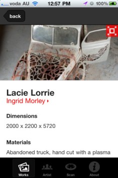
To solve one of the big problems with QR codes – that people just can’t be bothered downloading a QR code reading application (or firing it up if they do have one), our internal developer Carlos Arroyo has built the exhibition iPhone and Android App with the QR code scanner built in! This means anyone who downloads the exhibition App – itself a full catalogue of the exhibition designed for in-gallery supplementary browsing now also has their QR scanner at their finger tips.

As the QRs are scanned – from within the App – the relevant exhibition object immediately launches in the App. Carlos has also managed to nail down error correction and the scanning is now really good even in low light and on low resolution cameras.

Like for Sydney Design and the Go Play Apps we’re using Flurry to track in-App actions so we can see which objects get scanned and viewed.

(There’s even a mobile website that mimics the App – without the scanner – if you don’t choose to install the App!).

We’ll keep you updated on how it goes and when the automated tracking goes live. Carlos is already working on a v1.1 version of the App to roll out shortly with some new interaction options.

Try out the iOS App in the AppStore. And the Android version of the App is on the Android market also.

Categories
Mobile QR codes

Shortened URLs as an alternative to QR codes

The first time we did something with QR codes at the Powerhouse was in 2008 during Sydney Design festival. Last year we experimented with them on object labels with mixed results.

Now for our latest fashion exhibition, Frock Stars, we’ve replaced QR codes on labels with our new shortened URLs.

We’ll be keeping an eye on how these go.

My gut feeling is that these get around the application requirements and the scanning and light issues of QR codes – and whilst they may not attract ‘curious’ visitors, they should be obvious enough for those visitors who really do want to ‘know more’.

Categories
Developer tools QR codes

Roll your own URL shorteners for your museum

Last week I got a tweet from Te Ara asking about URL shorteners as their favoured one, tr.im, had stopped accepting URLs.

So I’m happy to announce that we’ve implemented our own URL shortener – from.ph – for internal use only. Luke had been thinking about this for a couple of months and we’ve been lining up all the ducks before making it live.

From.ph is based on a modified version of Yourls, an open source PHP-based URL shortening solution. Implementing it was pretty straight forward and you’ll start seeing shortened URLs of the from.ph sort popping up form time to time if you encounter Powerhouse links out in the world.

In fact the biggest challenge was finding a sensible domain to use. Some of the best options we had were stymied by registrar requirements but I think we’ve found a good one that makes sense to human readers – whilst still being short enough to be useful.

All our collection records are now accessible in the form – http://from.ph/[object number]. For example, the 3830 steam locomotive can now be reached quickly and easily via http://from.ph/85075.

This is especially useful as we rethink the way in which we continue to roll out URLs in the galleries. Not only does the shortened URL make their inclusion on labels a little less intrusive, it also makes for simpler 2D barcodes (QRs etc).

Our upcoming Frock stars exhibition can be tweeted as http://from.ph/frockstars and The 80s are back is simply http://from.ph/80s.

And of course this blog is now easily reached at http://from.ph/sebchan.

Categories
Mobile QR codes User experience

A quick QR code update

As regular readers know, we’ve been trialling QR codes and a little while back rolled them on a small selection of object labels in a Japanese fashion display.

I’ve been keep an eye on their usage and some of the continuing problems around lighting, shadows, and low-resolution mobile phone cameras like the current iPhone 3G. So far usage has been, as expected, low. Firstly, the target audience for the exhibition content has, not surprisingly, not been very tech-savvy. Secondly, the ‘carrot’ isn’t clear enough to cause the audience to respond to the call to action.

More critically, one thing we still haven’t quite gotten right is the image size and error correction.

Shortly after the last post we upped the error correction in the codes to 30% (meaning that up to about 30% of the image can be obscured and it still scans – although it is isn’t evenly spread). This alone wasn’t enough.

With the long URLs encoded in the codes plus the error correction the resulting QR codes were even more ‘dense’ and hard to scan with 2 megapixel cameras. We’ve now done another set of codes with our own version of TinyURLs that generate locally. This has reduced the encoded characters from nearly 70 to around 25 characters – thus a far less dense code.

Even so, 2 megapixel cameras have patchy results when obscured by lens flare or shadow so our current thinking is that in the future the codes may need to be as much as 50% bigger.

Categories
Mobile QR codes

QR codes in the museum – problems and opportunities with extended object labels

I think QR codes have a lot of potential – potential that hitherto has not been realised. The underwhelming uptake of the codes outside of Japan has a lot to do with the poor quality marketing campaigns so far run with them. If I am going to have to install or worse still, find on my phone, a QR code reading application then the reason I am going to all this trouble has to be really really worthwhile.

I am yet to see a commercial campaign that delivers that compelling reason to install the reader.

On the otherhand, quite a few local artists are experimenting with them in interesting ways. If you are a Melbourne reader then maybe you spotted a guerilla art installation at Federation Square by Radical Cross Stitch!

Now QR codes are probably best seen just as mobile-readable URLs. If these URLs are just going to send me to a website that isn’t tailored for my context and device then they are going to be just a gimmick. But if, on the otherhand, they can deliver timely, mobile-formatted content to me that addressed my specific ‘need’ at the time then they might just work. I know there’s no way I am going to bother typing an URL into my phone whilst I stand in front of an advertisement. Even on the iPhone, typing of URLs is more painful than it should be (in fact I’d wager that most iPhone users follow links from other applications – Twitter, email etc – or use their bookmarks – anything to avoid typing URLs). On a standard numeric keypad mobile, forget typing URLs.

Now regular readers will remember our experiment with QR codes in August last year. We learnt a lot from that and now we’ve rolled out an experiment in a new display on the floor of the Museum.

As part of the Gene Sherman Contemporary Japanese fashion display each object label is now augmented with both a QR code and a longform object URL (just in case you can’t use the QR code).

Here’s a quick breakdown of the process.

Generating the codes

Once again we did this in-house – the main reason being that every mistake made internally helps us learn and grow. Sure, we could outsource the mistakes but in so doing we outsource the learning. And that’s not a good long term idea.

Problem #1 – All QR codes are not the same

Perhaps you thought that there was just one standard type of QR code? Well that’s not exactly true. QR codes can be generated at a number of ‘sizes’ (actually more like density than fixed dimension), with different percentages of error correction (in case a scan is blurred or partial), and the content can be stored in a number of ways. The first pass we made at generating codes for each object ended up working on most but not all of the QR code readers we tried. Finally we generated a series of codes that worked on all the readers we could find.

Problem #2 – Inconsistent size

One issue with QR codes is that they do change size as the content the are encoding increases. This is inrrespective of the density that you choose. A medium density encoding of “The Powerhouse Museum” is going to be smaller in size than one that says “The Powerhouse Museum is making QR codes”. Add higher error correction (tolerance) and they get bigger still. Now this isn’t usually a going to be a problem when single codes are going to be printed but when they need to go on object labels then, rightly, the exhibition designers want to have a standard size for the whole exhibit. This meant finding the longest possible code and designing for it.

Getting the content ready

Problem #3 – Making the mobile site

As we found in our initial QR trial last year one of the key failures was that we never built the encoded URL as mobile-friendly. This time we’ve changed large parts of our website and especially the collection database, to which the QR coes point, to be mobile-ready.

Installing the codes

Problem #4 – Perspex

So we now have QR codes that can be read by a variety of readers on a variety of phones with 2 megapixel to 5 megapixel cameras, and we have a website that is going to work on a phone. The next hurdle to be crossed was physical. At the Powerhouse we put our object labels behind 5mm thick perspex. This stops visitors from writing things on our labels (oh, the trust!) and means they last a lot longer in the galleries.

Another round of testing was required to work out the minimum size at which the QR codes could still be scanned with a 2 megapixel phone camera through the 5mm perspex.

Problem #5 – Shadows

And so off the labels went to be printed.

Installation day rolls around and I was in the gallery with my phone looking at the QR codes being installed below the written labels and thinking to myself “finally we have codes in the galleries!”.

Then I noticed the lights. Not just one light but multiple lights shining on the objects from behind where the visitor would stand. With this set up dark shadows were cast over exactly where the QR codes were being placed meaning that although the codes could be photographed, the shadows interfered with the ability to decipher the data in the codes.

Lights have been moved around a bit and now we have a better situation.

We are keeping an eye on usage and will report back once the display ends.

If you are in Sydney, come in and give it a go.

I am recommending free QR code reader application called BeeTagg mainly because it has different versions available for a range of phones – Symbian, Palm, Blackberry and iPhone.

Categories
Mobile QR codes

Some QR code clarifications

I’ve had several emails, tweets and general interest in more information about our QR code experiment so here’s some more information.

Firstly, it has to be said that the experiment was sub-optimal. We made mistakes – but I think that making mistakes in order to learn from them is something Australians (and museums) need to get a lot more comfortable with doing. I’ve outlined several of them already – the QR code was printed too small for low resolution cameras, and the URL to visit wasn’t optimised for mobile web browsers, etc. But does this, alone, explain the usage rates? I think not.

Secondly, it also needs to be said the campaign had a total cost of zero. We did not engage an ‘interactive agency’ (which is where some of the interest in our experiment has come from). The QR code was self generated and the idea of the experiment was to see what the actual take up of QR codes might be if completely umprompted.

Thirdly, the ‘incentive’ for bothering to use the QR code – free passes etc – may not have been great enough, especially if scanning the code the first time didn’t work for you.

Remembering that the Sydney Design 08 programme which contained the QR code had a run of 40,000 copies and was distributed widely across Sydney the ‘conversion’ rate of the experiment needs to be calculated in light of that – not just counting those who visited the ‘secret’ website after scanning the code.

Now it isn’t that simple of course – even someone with a QR capable phone with Sydney Design 08 programme in the hand needs is not necessarily going to bother scanning a code.

We are certainly going to do more experiments with QR codes – there is a lot of potential in them – and we are hoping that others will also make available the results of their trials. The sort of work the Tate is doing with their mobile/handheld wiki for the museum community is the kind of openness and knowledge sharing that needs to be more widespread.

Categories
Mobile QR codes

Sydney Design QR code wrap up – so did anyone use it?

A little while ago I blogged about an experiment we were doing with QR codes.

In summary, we placed a QR code in the back of the Sydney Design 08 festival programme which gave access to a discount voucher for the festival and ensured free entry to the Museum during the event.

The big question is, did anyone use it?

Before I tell you let’s look at a couple of ‘problems’ with what we did. These were barriers to participation that we had underestimated.

Firstly, the QR code itself was printed at a size that required a ‘decent’ cameraphone to scan it effectively. A lot of people with iPhones found that the size of the code itself didn’t work well with the 2mp iPhone camera. This would, of course, have been alleviated had the code appeared large on all street posters as well – but would have required integration into the visual design of the posters too – so that it did not dominate the design. Anyone who has seen Telstra’s QR campaign will know that the code is the poster.

Second, the QR code itself linked to a URL that was not optimised for mobile. This was made more problematic because the iPhone (currently the only mobile with a decent web browser) couldn’t read the code properly. Viewing the linked site on Opera on a Nokia, for example, made for a lot of annoying scrolling to complete the form to get your free pass.

Third, the application to read QR codes is not prominently available on most phones. Even on my recent model Nokia it is, by default, buried under Applications / Office / Barcode Reader.

This third problem will resolve itself in time and over that time, too, as mobile data charges drop more sites will become optimised for mobile viewing resolving problem two. In fact, we did use a WordPress plugin to ‘convert’ the Sydney Design site to be ‘mobile friendly’ as a test – but this really needs a manual touch.

So digging in to the stats we find –

144 views of the QR destination page
– 13 on Symbian devices, 3 on iPhone, rest of Windows versions or Safari versions
– 55 from Sydney and the rest interstate or overseas

33 successful form completions
26 successful ticket prints

Unfortunately we don’t have any figures on whether any of these 26 printouts were actually presented at the door of the Museum and redeemed.

Is this successful? For zero financial outlay this was always going to be a trial. We’ve learnt quite a lot about QR codes and their potential through doing this and we will certainly be experimenting more with them.

We know that there were several factors that meant we didn’t do this optimally, but we also know that QR code usage in Sydney is, understandably, low. We are probably still 3-5 years away from widespread public adoption and understanding – and beyond marketing we are still waiting for a ‘killer app’ to drive usage.

Categories
Mobile QR codes

Our first QR code experiment goes live

The Powerhouse Museum has gone live with its first public experiment with QR codes.

QR codes are really glorified barcodes with the capacity to hold far more information than a standard barcode. Because of the prevalence of mobile phone cameras and the desire of telcos to drive data usage on mobiles, QR codes are getting a bit of a push at the moment outside of Japan (where they began).